
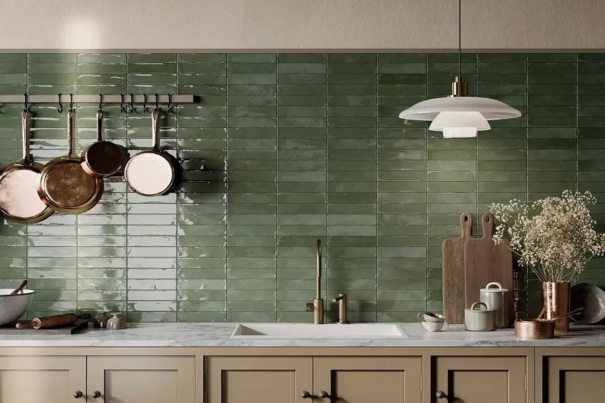
A boring wall does not always require a dramatic material upgrade to become more interesting. In many cases, the difference can be found in how the tiles are placed in relation to one another. A standard rectangular tile may look classic, modernized, youthful, or architectural, depending on the placement, spacing, and the room’s needs.
A great layout can make the wall appear wider, taller, or more contained – it can highlight the splashback’s length, lift a small bathroom’s ceiling, or define a modest decorating feature. It can also make a simple tile perform double duty, reducing the need for additional materials.
The seven options below offer a range of effect and complexity. Before selecting one, consider the surface’s size, the number and location of corners and outlets, the amount of light in the room, and how much visual weight the tiled surface is expected to carry.
Classic Running Bond
Running bond is the familiar brick layout in which the tiles in one row are placed between the gaps in the row below. It is a popular choice due to its ability to add motion to the design without overwhelming the surface. On a long splashback, the gently repeating pattern will draw the eye along with the length of the wall, while the slightly offset joints will relieve the angular rigidity of cabinets or countertops.
Read More: 5 Critical Maintenance Tips to Ensure Your Backup Power System Stays Reliable
It adds motion to the design while still leaving ample room for other elements, such as shelves, a cooker hood, or a statement tap, to command attention. A close grout color will help the bond blend into the overall pattern, while a contrasting tone will make it stand out.
Before laying, it is important to decide whether the offset will be directly in the middle of the tile or shifted to one side. While the former will produce the most familiar running bond effect, a smaller offset can make the pattern more interesting, especially for longer tiles. A few test rows can help determine if the visual effect will be desirable in this case.
Clean Horizontal Stack
In a horizontal stack pattern, the tiles are placed directly on top of one another, resulting in cleanly visible vertical and horizontal joints in the final design. It works best in combination with other clean lines, such as flat cabinets, square shelves, or a simple vanity.
It is critical to pay close attention to the layout, as minor imperfections in the tile or mortar bed will be immediately apparent in the final layout. The pattern’s regularity also means that any deviations from a true vertical will be glaringly obvious – the first few rows should be laid with spacers and extra attention paid to the plumb lines. Finally, the color of the mortar should be carefully selected to complement the overall design.
A neat horizontal stack allows the colors of the tiles to dominate the design due to the lack of other visual elements in the layout. Other surfaces should therefore be subdued to avoid overpowering the layout.
Vertical Stack for Extra Height
This pattern is similar to the horizontal stack in that the tiles are placed directly on top of one another, but the shift to a vertical orientation creates the illusion of height. The pattern has an especially dramatic effect when applied to a vanity or around a fireplace, as it directs the eye upward. It can also help in making a small kitchen appear taller, stretching the visual field vertically.
It is best to select a color with good depth for this pattern, in order to reinforce the sense of height. Homeowners who want to add height without choosing a busy pattern may find green subway tiles to be an especially good choice: the familiar rectangular outline does not distract from the main goal, while the color makes the wall stand out within the room.
The pattern can be extended to the very top of the wall for a seamless finish, or limited to a single panel for a subtle effect. It is especially important to plan ahead around outlets, recesses, and shelves, as these will break the continuity of the pattern.
Herringbone With Controlled Movement
The herringbone pattern places the rectangular tiles at an angle to one another in a continuously zigzagging line. It adds motion to the design and, compared to a simple running bond or a stacked layout, has a more dramatic effect overall. It should therefore be reserved for accents, such as the space between two cabinets, a niche in a shower, or a single panel.
It is critical to carefully plan out this pattern, as the center line acts as a guide for all of the other elements in the layout. An arbitrary choice of a center based on a particular location or design element may lead to an unbalanced result. Instead, begin by selecting the center of the wall or the main design element, such as a vanity, and test a few tiles in a similar fashion before committing to the full layout.
Due to the high number of angled cuts necessary for this pattern, it is especially important to account for extra waste when estimating the materials. Similarly, special attention should be given to the relationship between the tiles and the grout lines: a close color match will minimize distractions, while a contrasting tone will draw attention to the angles.
Vertical Running Bond
The vertical running bond pattern is a variation of the standard running bond, in which the tiles are rotated to a vertical position. They retain the gentle offset, but this time, the movement runs from top to bottom rather than side to side. The pattern has a less severe look than the vertical stack in some cases, while still adding visual height to the design.
It is a good choice for small spaces, as it rarely overwhelms them. It also works well where there is mild imperfection in the tile size, since the offset will mask inconsistencies.
As with all variations of the running bond, the visual effect will depend on the size of the offset from one row to the next. Just as with horizontal patterns, a larger offset will produce a more noticeable pattern in the overall layout. The end result should be tested for the specific wall height and conditions, as a simple offset at the top of the wall can produce a distracting set of narrow tiles at the end.
Blocks – Basketweave or Crosshatch
These patterns utilize a block format, in which small sections of the wall are dedicated to tiles with a particular orientation. They are similar to one another, except that the basketweave uses blocks of two different sizes, while the crosshatch pattern keeps the blocks roughly uniform. Together, they create a woven look on the surface of the wall, while keeping the individual blocks clearly defined.
Crosshatch is a good choice for small areas, as the visual interest is concentrated in the blocks rather than the pattern as a whole. At the same time, the pattern can become overwhelming if applied to a large surface. It therefore works best in a splashback, a niche, or another confined space that benefits from the illusion of being framed within a pattern.
The pattern should be laid out using rough measurements based on the tile’s approximate size. Some tiles can be grouped into blocks, while others will have to be cut to fit a particular pattern. A small section should therefore be laid out on a flat floor to visualize the effect, including the spaces that will be taken up by the grout lines: what may appear to be square blocks without them will shift noticeably when they are added.
Framed Feature Panel
Framed panels are a variation of the patterned surface, in which a design format – such as a running bond – is enclosed by a set of tiles that follow a different pattern. These can be seen as lines along the borders of the framed surface, or, in some cases, incorporate a full set of tiles on two sides. This pattern adds definition to the central portion, much like picture framing does to artwork or photos.
It can be used to set off the cooker, frame a vanity, or enclose a recessed shelf. It draws attention to the details within the panel, while also connecting it to the larger structure of the room. It can be used in conjunction with other design elements, such as the width of the cabinets or the size of a mirror, without overpowering them.
A framed panel requires extra care when estimating the materials, as the layout needs to accommodate the width of the border, the pattern within the panel, the grout lines, and, if necessary, the trim. Rather than estimating the panel’s content and the border separately, it is a good idea to begin with the outer dimensions and work backward. A simple framing pattern with a subtle variation can be much more effective than a heavy border that overwhelms the panel.
How To Choose The Right Layout for The Room
Choosing the right layout often comes down to the room’s particular needs. A working splashback will benefit from a less distracting pattern that can be easily matched to the overall color scheme of the kitchen. A small panel can accommodate more movement within the pattern due to its reduced visual impact.
It can also help to look at the room from the perspective of the primary viewing area. In some cases, furniture, the cooker, a mirror, or shelves will obscure a portion of the wall, which means that the pattern does not need to continue seamlessly all the way to the edges. A mathematically perfect center may appear strangely off-center from another vantage point.
The impact of lighting is difficult to estimate beforehand, since the reflective properties of the surface will affect the perceived differences between various areas. A glossy finish may appear different under natural and artificial light, especially when viewed at an angle. Layouts should therefore be evaluated in their final location, rather than on a table or a display board.
Finally, the pattern must be matched to the tools, skill level, and the time available. More elaborate patterns, such as herringbone or framed panels, will require additional preparation and cutting. The complexity of the task should be weighed against the available materials, such as the types of cuts the tools can produce, and the time and effort that can be dedicated to the project. Layouts that require working around complex corners or wet-area preparation should also be considered for a professional installation.
Plan the Layout Details Before Installation Begins
Each of the discussed patterns needs to be carefully tested before installation begins. The sample should incorporate the full set of spacers, in order to produce realistic joints that will match the intended effect. A level line should be marked, and the location of the first full tile should be determined. The placement of cut tiles along the top and bottom of the wall should also be reviewed in order to prevent having to deal with small, distracting tiles at either end.
The grout color must be carefully selected, as it can transform the entire pattern. A close color match will allow the mortar to blend into the design, while a contrasting color will draw attention to the tiles and their arrangement. Test tiles should be laid, along with samples of the intended grout, in order to see how the two will interact.
Read More: How to Navigate the Complexities of Restoring a Property After Water Ingress
The condition of the surface itself must also be carefully reviewed and prepared, according to the requirements of the tile, adhesive, grout, and waterproofing membranes. Particular attention must be paid to the recommendations from the manufacturers of the selected materials. On walls that are likely to get wet, the preparation needs to meet the specific local standards for those conditions.
Final Thoughts
A creative tile wall does not necessarily require a non-standard material to transform a bland surface. Attention to the placement and orientation of the tiles can be sufficient to achieve an entirely new effect. The running bond pattern is a good place to experiment with motion in the layout, while the stacked pattern keeps the design contained and controlled. Vertical laying adds visual height to the design, and herringbone or crosshatch provide additional detail in a contained format.
It is important to dedicate time and effort to the dry layout before beginning the actual work. The overall pattern should be reviewed from the perspective of the main viewing position in the room, and the cut tiles should be arranged to minimize visual clutter at the ends. This attention to detail will ensure that the pattern feels like a natural extension of the room rather than a distracting addition.
1 thought on “7 Creative Tile Layouts To Make a Boring Wall Pop”